Back To My Work
Savoy
Savoy
PROTOTYPING
PROTOTYPING
PROTOTYPING
USER TESTING
USER TESTING
USER TESTING
FIGMA
FIGMA
FIGMA
UX RESEARCH
UX RESEARCH
UX RESEARCH
DESIGN SYSTEMS
DESIGN SYSTEMS
DESIGN SYSTEMS

My Role
My Role
My Role
User research: Empathy maps, Interviews, Competitive analysis, Personas, Affinity diagrams, User journey maps
UX design: Crazy 8s, Iterative wireframing, Storyboards, Testing sessions, User flow diagrams, Accessibility accommodation Prototyping, Usability studies, Insight generation
Communication: Storytelling & Narrative
User research: Empathy maps, Interviews, Competitive analysis, Personas, Affinity diagrams, User journey maps
UX design: Crazy 8s, Iterative wireframing, Storyboards, Testing sessions, User flow diagrams, Accessibility accommodation, Prototyping, Usability studies, Insight generation
Communication: Storytelling & Narrative
User research: Empathy maps, Interviews, Competitive analysis, Personas, Affinity diagrams, User journey maps
UX design: Crazy 8s, Iterative wireframing, Storyboards, Testing sessions, User flow diagrams, Accessibility accommodation Prototyping, Usability studies, Insight generation
Communication: Storytelling & Narrative
Project Context
Project Context
Project Context
May 2022 - Jan 2023 (part-time) Coursework project
May 2022 - Jan 2023 (part-time)
Coursework project
May 2022 - Jan 2023 (part-time)
Coursework project
Tools
Tools
Tools
Figma
Adobe suite
Mural
Figma
Adobe suite
Mural
Summary
Summary
Summary
Designing a Savoy cinema app to find movies 2× faster than their site—with better accessibility, personalisation, and convenience.
Designing a Savoy cinema app to find movies 2× faster than their site—with better accessibility, personalisation, and convenience.
Background
Background
Background
I enjoy watching films and going to the theatre, and I came across Savoy Cinema, a UK cinema chain serving over 100,000± customers. Savoy provided a typical cinema experience. They allowed users to book tickets only through their website or at physical locations. Their goal was to attract customers via their website, social media, and word of mouth.
I enjoy watching films and going to the theatre, and I came across Savoy Cinema, a UK cinema chain serving over 100,000± customers. Savoy provided a typical cinema experience. They allowed users to book tickets only through their website or at physical locations. Their goal was to attract customers via their website, social media, and word of mouth.
Problem
Problem
Problem
However, their website and competitor apps had UI/UX flaws, including difficulty with basic tasks like changing location, and a lack of features such as personalisation and accessibility. The lack of an app, UX/UI problems and missing features put them at risk of losing customers to competitors. There was an opportunity for a well-designed dedicated app to attract more moviegoers.
However, their website and competitor apps had UI/UX flaws, including difficulty with basic tasks like changing location, and a lack of features such as personalisation and accessibility. The lack of an app, UX/UI problems and missing features put them at risk of losing customers to competitors. There was an opportunity for a well-designed dedicated app to attract more moviegoers.
Results
Results
Results
Design highlights:
Enhanced accessibility: Clean design with minimised text, large buttons for big fingers, screen reader compatibility, and labelled icons.
Rapid access: 200% faster than the website for key features.
Latest design trends: The app features faster and more modern design patterns than the website, like the convenient date selector feature.
Immediate movie information: "Now Showing" and "Coming Soon" are visible upfront, eliminating login hurdles.
Location flexibility: Seamlessly switch showtime locations within the app, without relying on external search engines (Google search).
Personalised experience: Review options and minimised unwanted notifications boost engagement.

Process
Process
Design Thinking
Process - Design Thinking
Design Thinking
I followed an iterative user-centered design process. Because it allowed me to generate a solution, involve users with testing, and end with a better design with iterative improvements.
I followed an iterative user-centered design process. Because it allowed me to generate a solution, involve users with testing, and end with a better design with iterative improvements.

Challenges
Challenges
How I Found Solutions to Challenges
Challenges - How I Found Solutions to Challenges
How I Found Solutions to Challenges
I faced a few challenges that I had to overcome. Overcoming the colour system was a major breakthrough for the quality.
I faced a few challenges that I had to overcome. Overcoming the colour system was a major breakthrough for the quality.
01. Visually unbalanced design
0.1 - Visually unbalanced design
Red with white text matched the website's palette but hurt readability. I switched to a 60-30-10 palette with black as the primary background colour, boosting legibility and adding a cinematic feel.
Red with white text matched the website's palette but hurt readability. I switched to a 60-30-10 palette with black as the primary background colour, boosting legibility and adding a cinematic feel.
Empathise. 1
Empathise. 1
User Interviews & Pain Points
Empathise. 1 - User Interviews & Pain Points
User Interviews & Pain Points
I conducted interviews with 5 diverse users and created user bios and empathy maps to understand user feelings, frustrations, and needs. In interviews with diverse participants, I asked them to describe their experiences and challenges when finding movies to watch. Also their decision-making process, motivations for going to the theatre and their feelings about watching trailers.
I conducted interviews with 5 diverse users and created user bios and empathy maps to understand user feelings, frustrations, and needs. In interviews with diverse participants, I asked them to describe their experiences and challenges when finding movies to watch. Also their decision-making process, motivations for going to the theatre and their feelings about watching trailers.
Participant characteristics:
Participant characteristics:
Participant characteristics:
Seen a movie in theatres in the past year (solo or with company).
Does not have to be the ticket buyer.
Likes to stream shows and watch movies.
Has experience using movie trailer apps or websites.
Include participants of different ages, genders, and abilities.
Seen a movie in theatres in the past year (solo or with company).
Does not have to be the ticket buyer.
Likes to stream shows and watch movies.
Has experience using movie trailer apps or websites.
Include participants of different ages, genders, and abilities.
Research goals:
Research goals:
Research goals:
To understand motivations and frustrations in the user journey from movie selection to final viewing at the theatre (solo or with company).
To understand the frustrations of finding films to watch.
To understand frustrations faced when using existing apps and websites to watch trailers.
To understand the effect of trailers on the feelings of users.
Pain Points
Pain Points

Bad recommendations:
Bad recommendations:
Platforms for viewing trailers for upcoming movies gave irrelevant recommendations.
Non-personalised notifications were viewed as spam, causing frustration.
On some platforms, users had no intuitive way to control notifications.
Platforms for viewing trailers for upcoming movies gave irrelevant recommendations.
Non-personalised notifications were viewed as spam, causing frustration.
On some platforms, users had no intuitive way to control notifications.

Censorship:
Censorship:
Some platforms for viewing trailers did not allow users to voice their opinions.
Users wished they could see expert movie critic ratings.
Users wanted to know more about the potential movie quality from other users.
Some platforms for viewing trailers did not allow users to voice their opinions.
Users wished they could see expert movie critic ratings.
Users wanted to know more about the potential movie quality from other users.

Usability + IA:
Usability + IA:
Some platforms were text heavy with high cognitive load (perceived effort).
Savoy's website lacked an easy way to switch showtime locations, forcing users to use external search engines.
Some basic user flows like finding specific movies and their schedules were not intuitive
Some platforms were text heavy with high cognitive load (perceived effort).
Savoy's website lacked an easy way to switch showtime locations, forcing users to use external search engines.
Some basic user flows like finding specific movies and their schedules were not intuitive

Insecurity:
Insecurity:
Not watching trailers caused less excitement and created more insecurity about movie quality.
Not watching trailers caused confusion around what the movies are about.
Not watching trailers caused less excitement and created more insecurity about movie quality.
Not watching trailers caused confusion around what the movies are about.
Empathise. 2
Empathise. 2
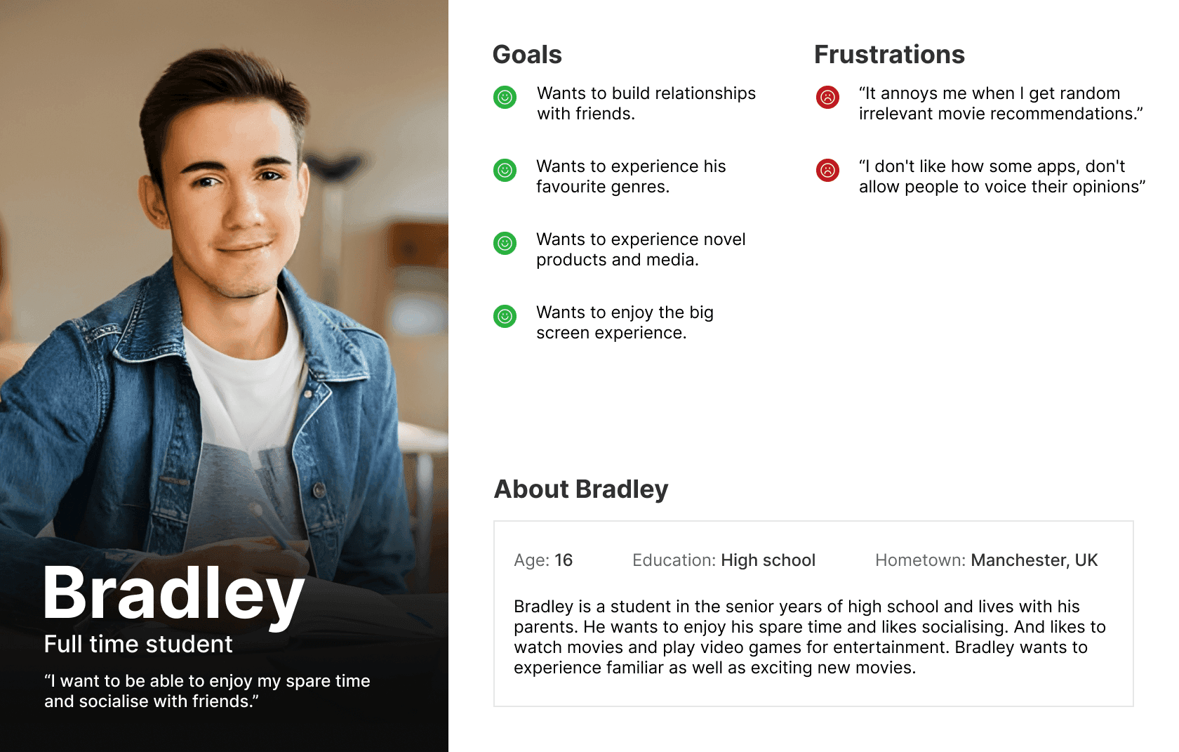
User Personas
Empathise - User Personas
User Personas
I generated a few personas after analysis of the data gathered from interviews, to represent the needs of a collective group of users. I used the user personas when brainstorming features to ensure I addressed their specific needs. For example Bradley here would require a feature to limit movie recommendations he's notified about.
I generated a few personas after analysis of the data gathered from interviews, to represent the needs of a collective group of users. I used the user personas when brainstorming features to ensure I addressed their specific needs. For example Bradley here would require a feature to limit movie recommendations he's notified about.
Define
Define
Research Methods
Define - Research Methods
Research Methods
After learning about potential users and their pain points I conducted further research with competitor analysis and user journey maps. And then defined solutions through various statements, to give a direction when generating ideas.
After learning about potential users and their pain points I conducted further research with competitor analysis and user journey maps. And then defined solutions through various statements, to give a direction when generating ideas.

Ideate
Ideate
Wireframing & Prototyping
Ideate - Wireframing & Prototyping
Wireframing & Prototyping
Building on the opportunities identified in my research, I generated a range of ideas and created paper and digital wireframes. I started with ideating useful features using Crazy 8's based on the research gathered. I then generated paper wireframes implementing those ideas. I went through an iterative process, landing on a few versions of the screens, and then I combined the best aspects of each screen into one.
Building on the opportunities identified in my research, I generated a range of ideas and created paper and digital wireframes. I started with ideating useful features using Crazy 8's based on the research gathered. I then generated paper wireframes implementing those ideas. I went through an iterative process, landing on a few versions of the screens, and then I combined the best aspects of each screen into one.
Key design areas:
Key design areas:
Key design areas:
Making a fast movie discovery process with clear movie information
Making a more personalised content recommendation system
Having an easy and intuitive review system and flow
Having simple and intuitive navigation for the main user flows
Having equitable design for users with disabilities or particular needs
Paper Wireframes
Paper Wireframes
Paper Wireframes


Prototype. 1
Prototype. 1
Digital Wireframes & Low Fidelity Prototype
Prototype. 1 - Digital Wireframes & Low Fidelity Prototype
Digital Wireframes & Low Fidelity Prototype
Next, I moved on to creating digital wireframes. I made sure to consider user needs from research. I wanted it to have easy navigation and to have it work with assistive technologies. I compiled the wireframes into a low-fidelity prototype so users could understand and test the product concept.
Next, I moved on to creating digital wireframes. I made sure to consider user needs from research. I wanted it to have easy navigation and to have it work with assistive technologies. I compiled the wireframes into a low-fidelity prototype so users could understand and test the product concept.
Movie discovery
Movie discovery
Movie discovery
Reviewing
Reviewing
Reviewing
Location selection
Location selection
Location selection
Test
Usability Study
Test - Usability Study
Usability Study
The prototype was tested by 5 diverse users who had the characteristics of potential final users, and a SUS survey was also done. This was done to identify tasks where users struggled. An affinity diagram was used to find themes and gather insights for improving the product. Some of the key areas of improvement are shown below.
The prototype was tested by 5 diverse users who had the characteristics of potential final users, and a SUS survey was also done. This was done to identify tasks where users struggled. An affinity diagram was used to find themes and gather insights for improving the product. Some of the key areas of improvement are shown below.
Main Insights
Main Insights
Main Insights
1
More intuitive trailer viewing:
More intuitive trailer viewing:
More intuitive trailer viewing:
Users need better cues to watch trailers for on-schedule movies.
Users need better cues to watch trailers for on-schedule movies.
2
More intuitive reviewing:
More intuitive reviewing:
More intuitive reviewing:
Users need a more intuitive way to access the review section.
Users need a more intuitive way to access the review section.
3
Better location page copy:
Better location page copy:
Better location page copy:
Users need better-worded cues for the location-changing process.
Users need better-worded cues for the location-changing process.
Iterative Improvements
Iterative Improvements
Iterative Improvements

Added an intuitive "play trailer" CTA:
Added an intuitive "play trailer" CTA:
Added an intuitive "play trailer" CTA:
Changed the play button to “play trailer” for better accessibility, more widely understood by non tech-savvy users.
This creates a more intuitive process and is more screen reader friendly.
Higher contrast colours are easier to see and gets noticed quicker.
Changed the play button to “play trailer” for better accessibility, more widely understood by non tech-savvy users.
This creates a more intuitive process and is more screen reader friendly.
Higher contrast colours are easier to see and gets noticed quicker.
Changed the play button to “play trailer” for better accessibility, more widely understood by non tech-savvy users.
This creates a more intuitive process and is more screen reader friendly.
Higher contrast colours are easier to see and gets noticed quicker.
Added a simple review button:
Added a simple review button:
Added a simple review button:
Added a review call to action button above the fold.
This reduces the effort the user needs compared to scrolling to the bottom.
Above the fold position means it's more likely to catch the user’s attention.
Added a review call to action button above the fold.
This reduces the effort the user needs compared to scrolling to the bottom.
Above the fold position means it's more likely to catch the user’s attention.
Added a review call to action button above the fold.
This reduces the effort the user needs compared to scrolling to the bottom.
Above the fold position means it's more likely to catch the user’s attention.


Simplified copy & added hierarchy:
Simplified copy & added hierarchy:
Simplified copy & added hierarchy:
Changed the wording of assistive copy to a call to action style.
This is shorter and easier to process for the user.
The font style has been changed for new visual hierarchy which better catches attention.
Changed the wording of assistive copy to a call to action style.
This is shorter and easier to process for the user.
The font style has been changed for new visual hierarchy which better catches attention.
Changed the wording of assistive copy to a call to action style.
This is shorter and easier to process for the user.
The font style has been changed for new visual hierarchy which better catches attention.
Prototype. 2
Prototype. 2
High Fidelity Prototype
Prototype. 2 - High Fidelity Prototype
High Fidelity Prototype
I created mock-ups to resemble the final look. I iterated using the latest design patterns and trends for features like the date selector. And built a prototype so users could test and visualise the final concept. I used the Savoy brand colours and fonts to keep brand consistency. I eventually iterated colours to follow a 60-30-10 colour rule which made the UI look a lot better. I used a 4 column grid and 8pt spacing for the layout which helped with scaling.
I created mock-ups to resemble the final look. I iterated using the latest design patterns and trends for features like the date selector. And built a prototype so users could test and visualise the final concept. I used the Savoy brand colours and fonts to keep brand consistency. I eventually iterated colours to follow a 60-30-10 colour rule which made the UI look a lot better. I used a 4 column grid and 8pt spacing for the layout which helped with scaling.


Results
Results
Final Prototype
Results - Final Prototype
Final Prototype
After iterating based on usability studies, I developed a final prototype which showcased a final app experience. Offering a more accessible and convenient design, following newer design patterns, compared to their website. With fast navigation, large buttons for big fingers, and labelled icons. Personalised and custom notifications. The app achieved the goal of enhancing engagement, personalisation, accessibility, and overall UX.
After iterating based on usability studies, I developed a final prototype which showcased a final app experience. Offering a more accessible and convenient design, following newer design patterns, compared to their website. With fast navigation, large buttons for big fingers, and labelled icons. Personalised and custom notifications. The app achieved the goal of enhancing engagement, personalisation, accessibility, and overall UX.
Simple & intuitive movie discovery:
Simple & intuitive movie discovery:
Simple & intuitive movie discovery:
Users can switch showtime locations with reduced time and effort by not having to rely on external search engines.
The pages are less text heavy and more accessible by having short expandable descriptions.
Users can find movies 200% faster from the app with less effort, than Savoy's website.
Users can switch showtime locations with reduced time and effort by not having to rely on external search engines.
The pages are less text heavy and more accessible by having short expandable descriptions.
Users can find movies 200% faster from the app with less effort, than Savoy's website.
Users can switch showtime locations with reduced time and effort by not having to rely on external search engines.
The pages are less text heavy and more accessible by having short expandable descriptions.
Users can find movies 200% faster from the app with less effort, than Savoy's website.
Easily view and share critique:
Easily view and share critique:
Easily view and share critique:
The user can share reviews and see others', creating a personalised experience.
The review option can be intuitively found above the fold, which increases engagement.
Users can also read expert reviews with the IMDB and Rotten Tomatoes reviews.
The user can share reviews and see others', creating a personalised experience.
The review option can be intuitively found above the fold, which increases engagement.
Users can also read expert reviews with the IMDB and Rotten Tomatoes reviews.
The user can share reviews and see others', creating a personalised experience.
The review option can be intuitively found above the fold, which increases engagement.
Users can also read expert reviews with the IMDB and Rotten Tomatoes reviews.
Get personalised notifications:
Get personalised notifications:
Get personalised notifications:
The Notify List feature, absent in 75% of analysed competitors, allows users to choose movies for notifications.
This reduces the frustration of receiving notifications about uninteresting movies.
The Notify list adds movies to a list that notifies users with reminders, of when it is showing so they don't miss it.
Interactive Prototype
Interactive - Prototype
Test Final Interactive Prototype
Interactive Prototype - Test Final Interactive Prototype
Test Final Interactive Prototype
Design System
Design System
The Design System Followed Brand Guidelines
Design System - The Design System Followed Brand Guidelines
The Design System Followed Brand Guidelines
I adopted Savoy's typefaces and colours to maintain brand consistency, while adjusting colour values to meet WCAG contrast standards. To enhance readability for all users, including those with visual impairments, in various lighting conditions.
I adopted Savoy's typefaces and colours to maintain brand consistency, while adjusting colour values to meet WCAG contrast standards. To enhance readability for all users, including those with visual impairments, in various lighting conditions.


Other Work
Other Work
Other Work

PadmadKenya
PadmadKenya
Redesigning PadmadKenya's e-commerce site for a smoother user experience and boosting conversions by 30-60%+.
Redesigning PadmadKenya's e-commerce site for a smoother user experience and boosting conversions by 30-60%+.

CharmLife
CharmLife
Redesigning start-up CharmLife's web app for responsiveness, improving design systems, accessibility and UI/UX.
Redesigning start-up CharmLife's web app for responsiveness, improving design systems, accessibility and UI/UX.

UI Showcase
UI Showcase
Explore a vibrant collection of various designs on Dribbble, each one crafted to perfectly suit a unique purpose.
Explore a vibrant collection of various designs on Dribbble, each one crafted to perfectly suit a unique purpose.